Graphics
This is a sample for plotting with Python. There are 2 principal libraries for plotting,
the library matplotlib that it has many utilities like mplfinance for the visualization, and visual analysis, of financial data
the library plotly that it is a very interesting tool makes interactive and publication-quality graphs
With pandas_datareader library you can download the historical data and with pandas library you can make the data range.
[1]:
# initialization
import pandas as pd
from pandas_datareader import data as pdr
start='2017-10-30'
end='2020-10-08'
amzn = pdr.DataReader('AMZN', 'yahoo', start, end)
# simple indicators
amzn['SMA25'] = amzn['Close'].rolling(25).mean()
amzn['EMA25'] = amzn['Close'].ewm(span=25, adjust=False).mean()
amzn['STD25'] = amzn['Close'].rolling(25).std()
amzn['Upper Band'] = amzn['SMA25'] + (amzn['STD25'] * 2)
amzn['Lower Band'] = amzn['SMA25'] - (amzn['STD25'] * 2)
# data ranges
all_bm = pd.date_range(start=start, end=end, freq='BM')
all_range = pd.date_range(start=start, end=end)
amzn_bm = amzn.reindex(all_bm)
amzn_bm_all = amzn_bm.reindex(all_range)
amzn_all = amzn.reindex(all_range)
piece_d = pd.date_range(start='2020-01-01', end='2020-10-01')
amzn_bm_piece_d = amzn_bm.reindex(piece_d)
amzn_piece_d = amzn.reindex(piece_d)
piece_bm = pd.date_range(start='2020-01-01', end='2020-10-01', freq='BM')
amzn_bm_piece_bm = amzn_bm.reindex(piece_bm)
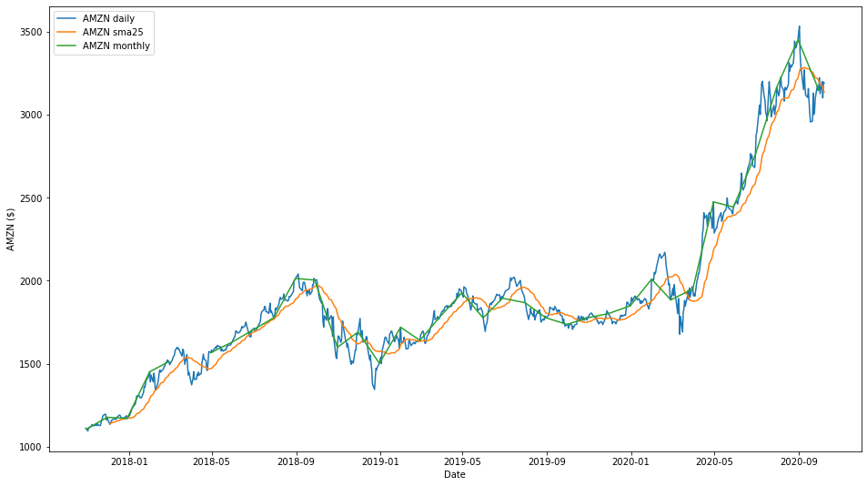
Matplotlib is very powerful: you can add tracks with different date range.
[2]:
# plot with daily, monthly and sma 25
import matplotlib.pyplot as plt
fig, ax = plt.subplots(figsize=(16,9))
ax.plot(amzn['Close'].index, amzn['Close'], label='AMZN daily')
ax.plot(amzn['SMA25'].index, amzn['SMA25'], label='AMZN sma25')
ax.plot(amzn_bm['Close'].index, amzn_bm['Close'], label='AMZN monthly')
ax.set_xlabel('Date')
ax.set_ylabel('AMZN ($)')
ax.legend()
plt.show()
#plt.savefig('plot.with.daily.monthly.sma.25.png')
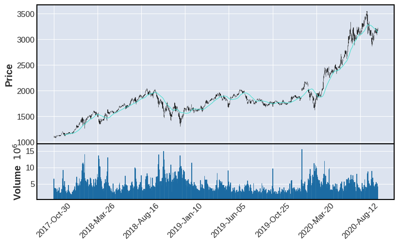
mplfinance contains the matplotlib finance API that makes it easier to create financial plots.
[3]:
# plot with candle daily and sma 25
!pip install mplfinance
import mplfinance as mpf
kwargs = dict(type='candle',mav=(25),volume=True,figratio=(16,9),figscale=1)
mpf.plot(amzn,**kwargs)
#plt.savefig('plot.with.candle.daily.sma.25.png')
Requirement already satisfied: mplfinance in /opt/conda/lib/python3.8/site-packages (0.12.7a4)
Requirement already satisfied: pandas in /opt/conda/lib/python3.8/site-packages (from mplfinance) (1.1.5)
Requirement already satisfied: matplotlib in /opt/conda/lib/python3.8/site-packages (from mplfinance) (3.3.3)
Requirement already satisfied: kiwisolver>=1.0.1 in /opt/conda/lib/python3.8/site-packages (from matplotlib->mplfinance) (1.3.1)
Requirement already satisfied: cycler>=0.10 in /opt/conda/lib/python3.8/site-packages (from matplotlib->mplfinance) (0.10.0)
Requirement already satisfied: pillow>=6.2.0 in /opt/conda/lib/python3.8/site-packages (from matplotlib->mplfinance) (8.0.1)
Requirement already satisfied: numpy>=1.15 in /opt/conda/lib/python3.8/site-packages (from matplotlib->mplfinance) (1.19.4)
Requirement already satisfied: python-dateutil>=2.1 in /opt/conda/lib/python3.8/site-packages (from matplotlib->mplfinance) (2.8.1)
Requirement already satisfied: pyparsing!=2.0.4,!=2.1.2,!=2.1.6,>=2.0.3 in /opt/conda/lib/python3.8/site-packages (from matplotlib->mplfinance) (2.4.7)
Requirement already satisfied: six in /opt/conda/lib/python3.8/site-packages (from cycler>=0.10->matplotlib->mplfinance) (1.15.0)
Requirement already satisfied: pytz>=2017.2 in /opt/conda/lib/python3.8/site-packages (from pandas->mplfinance) (2020.5)
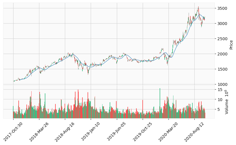
There are many styles to customize your graphs.
[4]:
# plot with candle daily, sma 25 and yahoo style
mpf.plot(amzn,**kwargs,style='yahoo')
#plt.savefig('plot.with.candle.daily.sma.25.yahoo.style.png')
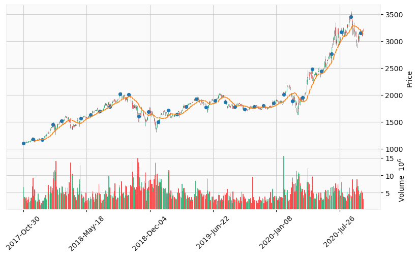
You can add an array of plots that each has to be a dateframe.
[5]:
# plot with candle daily, monthly points, sma 25 and yahoo style
aps = [
    mpf.make_addplot(amzn_all['SMA25']),
    mpf.make_addplot(amzn_bm_all['Close'],type='scatter')
]
mpf.plot(amzn_all,**kwargs,style='yahoo',addplot=aps)
#plt.savefig('plot.with.candle.daily.monthly.points.sma.25.yahoo.style.png')
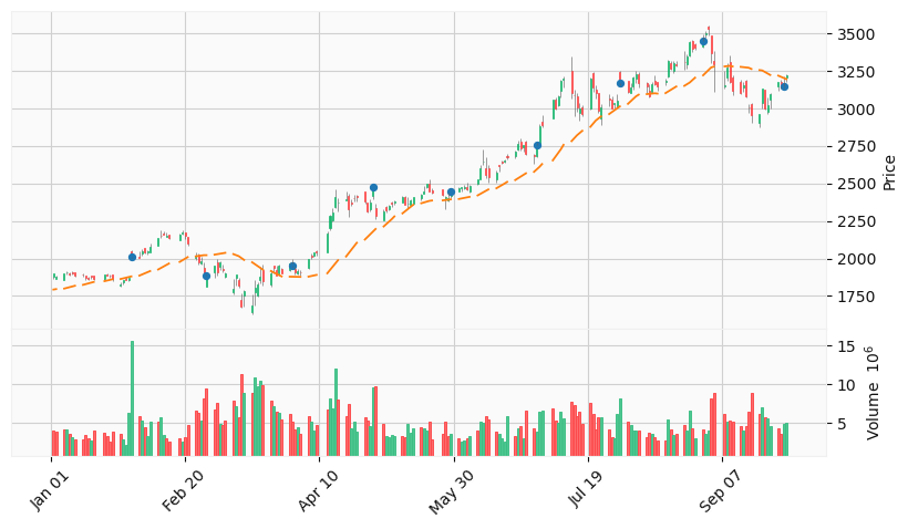
You can enlarge a window to observe that the weeks are not contiguous.
[6]:
# plot with candle daily, monthly points, sma 25 and yahoo style on a little date range
aps = [
    mpf.make_addplot(amzn_piece_d['SMA25']),
    mpf.make_addplot(amzn_bm_piece_d['Close'],type='scatter')
]
mpf.plot(amzn_piece_d,**kwargs,style='yahoo',addplot=aps)
#plt.savefig('plot.with.candle.daily.monthly.points.sma.25.yahoo.style.little.range.png')
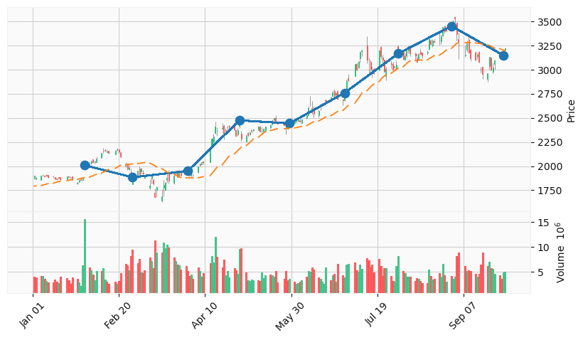
You can add an array of simple lines date-value or other specific lines for trends, support, resistance, and trading.
[7]:
# plot with candle daily, monthly points and monthly line, sma 25 and yahoo style on a little date range
subset = pd.DataFrame(amzn_bm_piece_bm['Close'])
amzn_bm_line = list(subset.itertuples(index=True, name=None))
aps = [
    mpf.make_addplot(amzn_piece_d['SMA25']),
    mpf.make_addplot(amzn_bm_piece_d['Close'],type='scatter',markersize=78)
]
mpf.plot(amzn_piece_d,**kwargs,style='yahoo',addplot=aps,alines=amzn_bm_line)
#plt.savefig('plot.with.candle.daily.monthly.points.monthly.line.sma.25.yahoo.style.little.range.png')
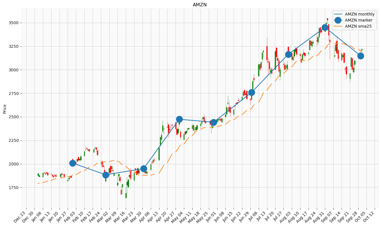
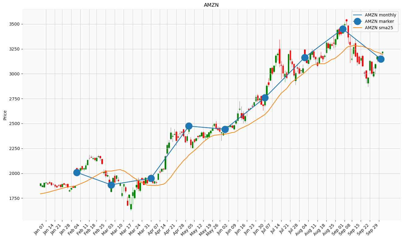
You can also plot with matplotlib style for having more customization like legend.
[8]:
# the previous plot with matplotlib style plus old finance modules
import matplotlib.dates as mdates
from matplotlib.dates import MONDAY, DateFormatter, DayLocator, WeekdayLocator
from mplfinance.original_flavor import candlestick_ohlc

# configurations
fig, ax = plt.subplots(figsize=(16,9))

mondays = WeekdayLocator(MONDAY)        # major ticks on the mondays
alldays = DayLocator()              # minor ticks on the days
weekFormatter = DateFormatter('%b %d')  # e.g., Jan 12
dayFormatter = DateFormatter('%d')      # e.g., 12
ax.xaxis.set_major_locator(mondays)
#ax.xaxis.set_minor_locator(alldays)
ax.xaxis.set_major_formatter(weekFormatter)
#ax.xaxis.set_minor_formatter(dayFormatter)
plt.setp(plt.gca().get_xticklabels(), rotation=45, horizontalalignment='right')

# grid
plt.rc('axes', grid=True)

# the plots
candlestick_ohlc(ax, zip(mdates.date2num(amzn_piece_d.index.to_pydatetime()),
                 amzn_piece_d['Open'], amzn_piece_d['High'],amzn_piece_d['Low'], amzn_piece_d['Close']),
                 colorup='g', colordown='r', width=0.6)
ax.plot(amzn_bm_piece_bm['Close'].index, amzn_bm_piece_bm['Close'], label='AMZN monthly')
ax.plot(amzn_bm_piece_bm['Close'].index, amzn_bm_piece_bm['Close'], label='AMZN marker', marker='o', markersize=16, color='C0')
ax.plot(amzn_piece_d['SMA25'].index, amzn_piece_d['SMA25'], label='AMZN sma25')

# other configurations
ax.set_title('AMZN')
#ax.set_xlabel('Date')
ax.set_ylabel('Price')
ax.legend()
plt.show()
#plt.savefig('plot.with.candle.daily.monthly.points.monthly.line.sma.25.matplotlib.style.little.range.png')
Another customization could be to remove the gaps.
[9]:
# the previous plot with matplotlib style without gaps
import numpy as np

# configurations
fig, ax = plt.subplots(figsize=(16,9))

# remove the gaps
data = pd.DataFrame(amzn_piece_d.dropna())
# Preserve dates to be re-labelled later.
x_dates = data.index.to_pydatetime()
# Override data['date'] with a list of incrementatl integers.
#   This will not create gaps in the candle stick graph.
data_size = len(x_dates)
data['Date'] = np.arange(start = 0, stop = data_size, step = 1, dtype='int')
# Re-arrange so that each line contains values of a day: 'date','open','high','low','close'.
quotes = [tuple(x) for x in data[['Date','Open','High','Low','Close']].values]

# Go through each x-tick label and rename it.
x_tick_labels = []
x_tick_positions = []
x_bm_line = []
for l_date in x_dates:
    date_str = ''
#    if l_date.strftime('%A') == 'Monday':
    if l_date.strftime('%A') == 'Tuesday':
        date_str = l_date.strftime('%b %d')
        x_tick_labels.append(date_str)
        x_tick_positions.append(list(x_dates).index(l_date))
    for date in amzn_bm_piece_bm.index:
        if l_date == date:
            x_bm_line.append(list(x_dates).index(l_date))
ax.set(xticks=x_tick_positions, xticklabels=x_tick_labels)
plt.setp(plt.gca().get_xticklabels(), rotation=45, horizontalalignment='right')

# grid
plt.rc('axes', grid=True)

# the plots
candlestick_ohlc(ax, quotes, colorup='g', colordown='r', width=0.6)
ax.plot(x_bm_line, amzn_bm_piece_bm['Close'], label='AMZN monthly')
ax.plot(x_bm_line, amzn_bm_piece_bm['Close'], label='AMZN marker', marker='o', markersize=16, color='C0')
ax.plot(data['Date'], data['SMA25'], label='AMZN sma25')

# other configurations
ax.set_title('AMZN')
#ax.set_xlabel('Date')
ax.set_ylabel('Price')
ax.legend()
plt.show()
#plt.savefig('plot.with.candle.daily.monthly.points.monthly.line.sma.25.matplotlib.style.little.range.without.gaps.png')
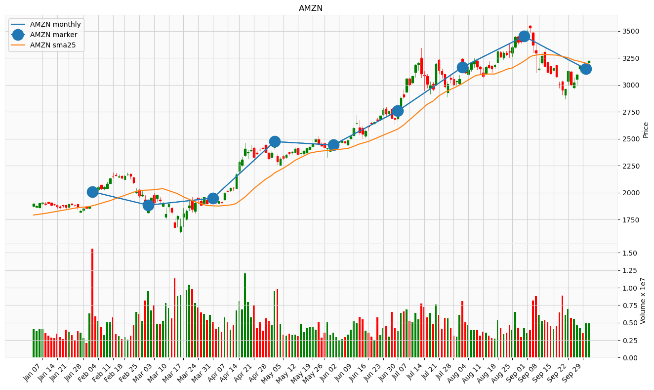
And to add the volume like bars.
[10]:
# the previous plot with matplotlib style without gaps plus volume

# configurations
fig, ax = plt.subplots(figsize=(16,9))
ax = plt.subplot2grid((3,3), (0,0), colspan=3, rowspan=2)
ax.yaxis.set_label_position('right')
ax.yaxis.tick_right()
ax2 = plt.subplot2grid((3,3), (2,0), colspan=3)
ax2.yaxis.set_label_position('right')
ax2.yaxis.tick_right()
#ax.axes.get_xaxis().set_visible(False)
fig.subplots_adjust(hspace=0)

# remove the gaps
data = pd.DataFrame(amzn_piece_d.dropna())
# Preserve dates to be re-labelled later.
x_dates = data.index.to_pydatetime()
# Override data['date'] with a list of incrementatl integers.
#   This will not create gaps in the candle stick graph.
data_size = len(x_dates)
data['Date'] = np.arange(start = 0, stop = data_size, step = 1, dtype='int')
# Re-arrange so that each line contains values of a day: 'date','open','high','low','close'.
quotes = [tuple(x) for x in data[['Date','Open','High','Low','Close']].values]

# Go through each x-tick label and rename it.
x_tick_labels_empty = []
x_tick_labels = []
x_tick_positions = []
x_bm_line = []
for l_date in x_dates:
    date_str = ''
#    if l_date.strftime('%A') == 'Monday':
    if l_date.strftime('%A') == 'Tuesday':
        date_str = l_date.strftime('%b %d')
        x_tick_labels.append(date_str)
        x_tick_labels_empty.append('')
        x_tick_positions.append(list(x_dates).index(l_date))
    for date in amzn_bm_piece_bm.index:
        if l_date == date:
            x_bm_line.append(list(x_dates).index(l_date))
#ax.set(xticks=x_tick_positions, xticklabels=x_tick_labels)
ax.set(xticks=x_tick_positions, xticklabels=x_tick_labels_empty)
ax2.set(xticks=x_tick_positions, xticklabels=x_tick_labels)
plt.setp(plt.gca().get_xticklabels(), rotation=45, horizontalalignment='right')

# grid
plt.rc('axes', grid=True)

# the plots
candlestick_ohlc(ax, quotes, colorup='g', colordown='r', width=0.6)
ax.plot(x_bm_line, amzn_bm_piece_bm['Close'], label='AMZN monthly')
ax.plot(x_bm_line, amzn_bm_piece_bm['Close'], label='AMZN marker', marker='o', markersize=16, color='C0')
ax.plot(data['Date'], data['SMA25'], label='AMZN sma25')

# make bar plots and color differently depending on up/down for the day
pos = data['Open']-data['Close']<0
neg = data['Open']-data['Close']>0
ax2.bar(data['Date'][pos],data['Volume'][pos],color='green',width=0.6,align='center')
ax2.bar(data['Date'][neg],data['Volume'][neg],color='red',width=0.6,align='center')

# other configurations
ax.set_title('AMZN')
#ax2.set_xlabel('Date')
ax.set_ylabel('Price')
ax2.set_ylabel('Volume x 1e7')
# avoid scientific notation (1e7)
ax2.get_yaxis().get_offset_text().set_visible(False)
ax.legend()
plt.show()
#plt.savefig('plot.with.candle.daily.monthly.points.monthly.line.sma.25.matplotlib.style.little.range.without.gaps.plus.volume.png')
Matplotlib is an advanced library for plotting everything you want, but maybe at the beginning, you need only to add the standard indicators.
It is simple to add Simple Moving Averages (SMA) with mplfinance, but this library contains only this indicator.
There are many libraries that they are a copy of TA-lib, an historical library of Technical Analisys.
some libraries are a wrapper of the original TA-lib, like mrjbq7/ta-lib, and it needs the original TA-lib is installed
some libraries are a wrapper of the Matplotlib, like ricequant/rqalpha
many libraries create plots, calculate indicators and make backtesting starting from the previous ones: you only have to choose what you like best
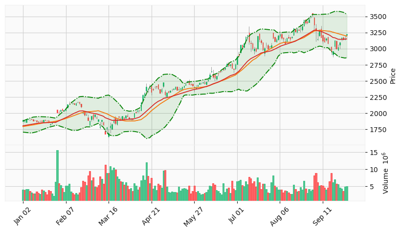
[11]:
# plot with candle daily, sma 25, ema 25 and yahoo style without gaps
data = pd.DataFrame(amzn_piece_d.dropna())
aps = [
    mpf.make_addplot(data['SMA25'],color='C1'), # orange
    mpf.make_addplot(data['EMA25'],color='C3'), # red
    mpf.make_addplot(data['Upper Band'],linestyle='-.',color='g'),
    mpf.make_addplot(data['Lower Band'],linestyle='-.',color='g'),
]
mpf.plot(data,**kwargs,style='yahoo',addplot=aps,fill_between=dict(y1=data['Lower Band'].values,y2=data['Upper Band'].values,alpha=0.1,color='g'))
#plt.savefig('plot.with.candle.daily.sma.25.ema.25.yahoo.style.without.gaps.png')